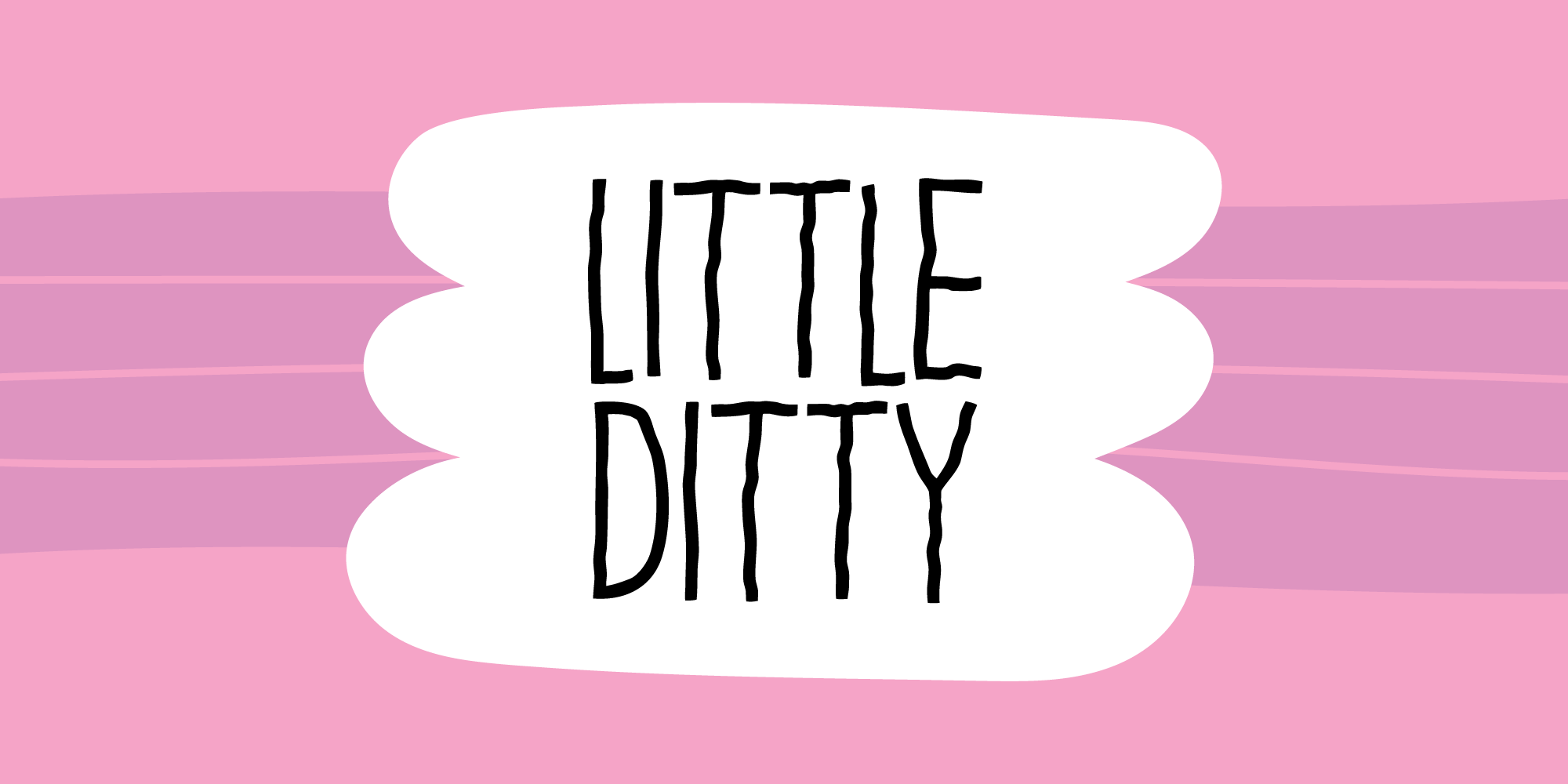



LITTLE DITTY
The strokes of Little Ditty are not perfectly straight and the edges may appear slightly rough. They may look asymmetrical, or slightly irregular - but the letters appear legible, even at smaller sizes. To enhance the imperfection, I have added a total of 5 different versions of each letter.
