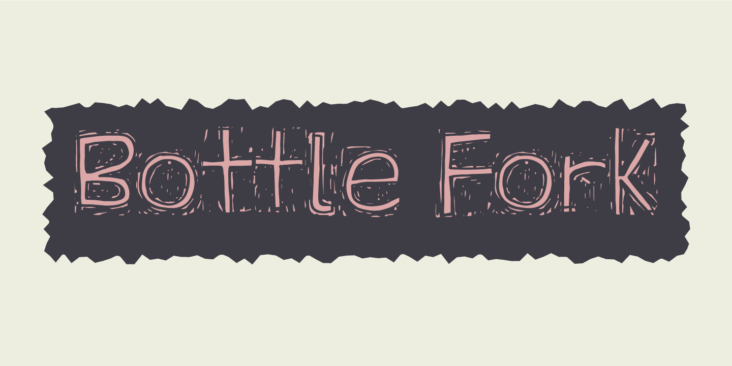
BOTTLE FORK
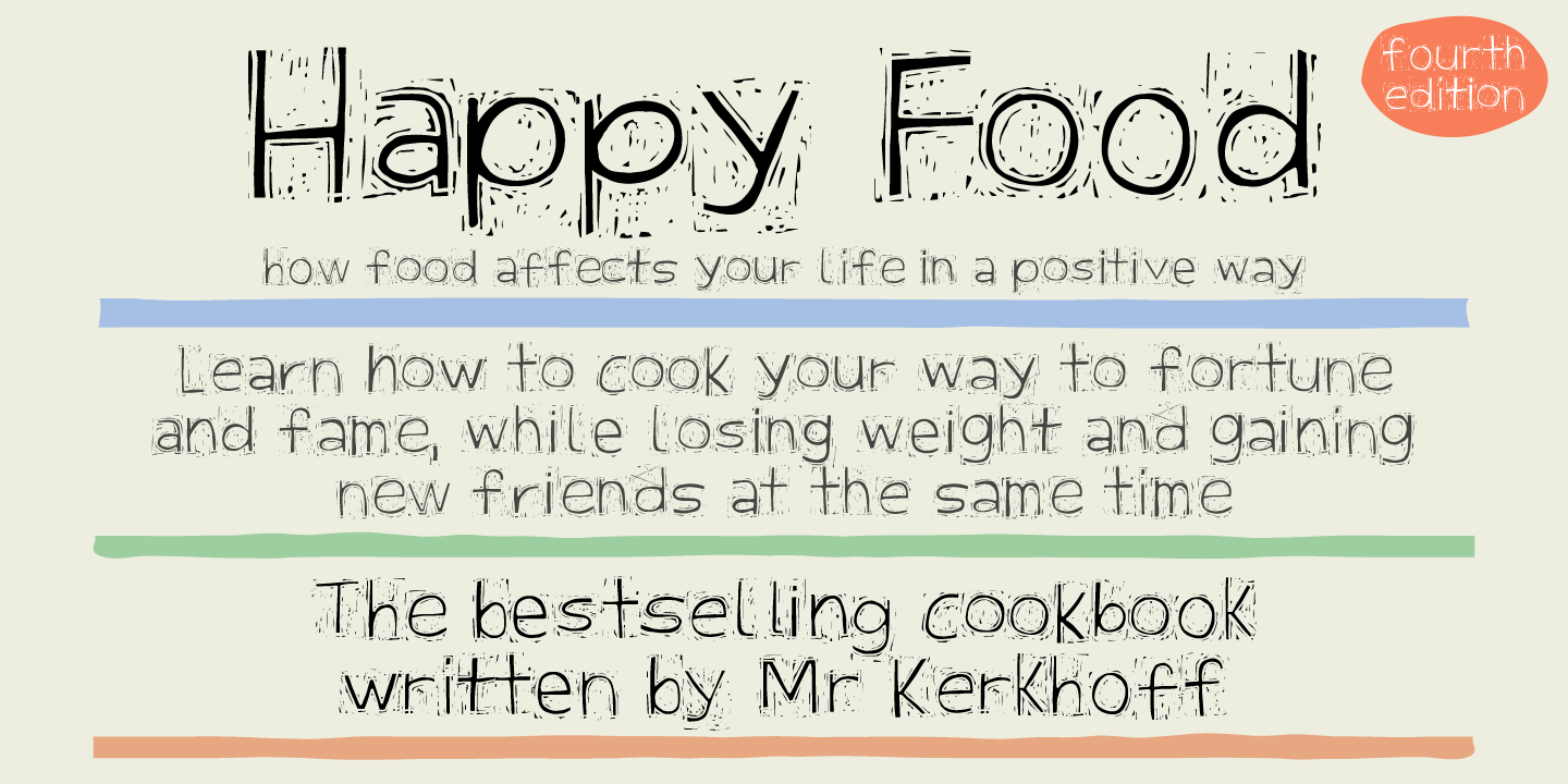
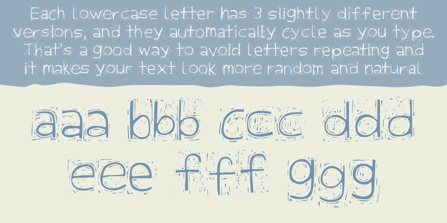
Here is my font with carved out letters, like a really bad stamp. Each lowercase letter has 3 different versions, and that makes your text more natural, organic and handmade. Normally I kern my fonts throughout, but this time there is no kerning at all…and that’s odd, when we’re not talking about monospaced fonts. Anyway, Bottle Fork has its flaws and jumpy x-height…but that’s exactly the charm of it all! :)
